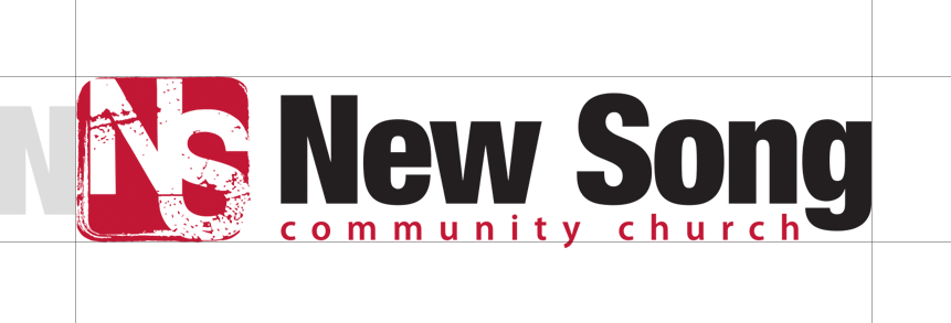
Our logotype is our most recognizable graphic and is meant to stand alone.
Color
The logotype should always contrast with the background. There are 3 versions of the logotype to ensure legibility and optimum reproduction quality in all printing processes and digital needs.
Full color
The full color – positive logotype is the preferred version and should be used wherever possible.
Monochrome
When there is a limited number of colors available for reproduction, or the quality of colors is questionable, choose the monochrome version. Only black and white should be used.
Clear Space
The clear space around the logotype on all sides should be equal to the width of the letter “N” in the logotype in order to maximum legibility and impact.
Minimum Size
To preserve legibility, the logotype should never be printed smaller than 1.75” wide and should never appear at less than 175 pixels wide in digital formats.
Improper Uses
The logotype cannot be altered or redrawn in any other way.
